Designing desktop applications for a Windows tablet PC !
Developing software for todays Windows Tablet PC’s can be a challenge for a number of reasons. First one must consider the effects of touch in an application. The user interface must be designed differently so the size of UI elements fits well with a tablets touch input (meaning a finger is different than a mouse, so the size of UI elements makes a big difference).
Here is a good guideline for building touch applications: http://msdn.microsoft.com/en-us/library/cc872774.aspx
Recognizing that what you build for Windows 7 today will likely be used later on Windows 8, I think it is important to consider the enitre look and feel of an application. Metro looks exciting, but personally I find the desktop offers more choices if you take advantage of them. Rather than simply design applications with the normal look and feel of todays desktop software, I really think one should “think outside of the box” as they say and to design user interfaces with as much graphic flare as possible. Take full advantage of color, graphics, multimedia, 3D and animation.
Lastly, tablet applications need to be lightweight (small footprint), fast and use minimal resources. If you can design software which requires minimal hardware (CPU, memory) and has a small footprint (requires little drive space) then you have an advantage.
EZGUI 5.0 and Powerbasic combined are a powerful solution.
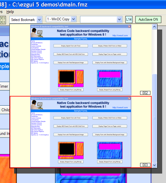
I designed EZGUI 5.0 Professional with a couple key goals, such as ease of use, small footprint, efficient use of resources and plenty of graphic capabilities. Because EZGUI is so graphic oriented, applications developed with it (and Powerbasic) are unique and they likely will stand out on a tablet PC. There are so many ways to customize controls, that the choices are almost unlimited. For example in the EZGUI 5.0 Visual Designer I created a unique control for the Visual Bookmark feature of the designer. In just a few lines of code I was able to create a custom combobox control with large bitmap images which were mini-screenshots of a form for each item, plus a nice drop shadow behind the control. Customization is the key here.
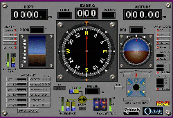
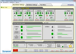
Some of my customers have really pushed the graphic look and feel of their applications and it shows. By using EZGUI’s ownerdraw engine, Canvas control, gradients and other features they have designed user interfaces which are unique a pleasure to use. Yet amazingly the applications still have a tiny footprint compared to others.


